3 Ways to Optimize your Lead Forms to Campaign Success

A great conversion is about garnering genuine interest in your business offerings and following up thereafter to nurture those leads for the long game. But this process won’t start if you can’t convince them to leave you their contact details!
Your campaign may look fantastic and, your website aesthetically pleasing, but if your form isn’t as well- optimized, you will lose many opportunities for lead generation. As gateway on the buyer’s path to purchase, the lead generation form is critical to your marketing campaign’s success.
Expedia managed to gain $12 million in profit by adjusting their forms. It wasn’t due to a grand shift in design direction, or to prodigious marketing tactics, it was a simple adjustment (or in this case, a deduction) on their lead generation form.
In this article, we’ll talk about the key factors that will help you craft a well- optimized form for your open web ad campaigns.
- Lead forms for ad campaigns
- Form above Fold
- Your Form’s Orientation
- Minimalistic Design
- What’s next?
Lead Forms for Ad Campaigns
Lead generation forms will have to be purposefully introduced onto your website, which means that it’ll be the first thing your customers see once they’re directed through from your ad campaigns.
Web form optimization is essential for good user experience, one of the easiest ways to improve conversion and increase sales.
Here are 3 ways to optimize your web forms for your advertising campaigns:
Form above The Fold
Visibility.
That’s the main reason why a form should almost always be at the top of your website. Eye tracking studies by Nielson Norman have stated that over 80% of people’s web page time is spent looking at information above the fold, so let it be the first thing that people see when they get directed to your website and it’ll ensure that you maximize conversions.
With open web ads, customers led to your landing page know what they’re in for, so hold back form overloading them with information and get straight to the point – conversion! Important elements like your CTA, form fields (which we will cover further down the article) contribute to the conversion rate of your forms, so put in the time and effort to optimize them well to serve a great first impression to visitors.
In this age of modern technology screen size orientation differs, therefore, the page that they land on initially is the most important. Engagement is mostly initiated above the fold, while the latter builds on your business/product.
However, if your offer is complex and requires users to read the information intricately, then perhaps placing it below the fold is more ideal so that they’ll be given enough time to absorb and digest what you have to offer.
Orientation
An aligned message throughout.
Your form has to be focused and aligned with your open web ad campaigns to achieve a greater impact. Its copy, elements, to even the emphasis on the right keywords, aligning these factors will lead to a linear, more persuasive lead generation form that is sure to catch your audience’s attention.
Your CTA is another key factor that you have to focus on, which can makes or breaks your conversion rate. Popular (and infamous) CTA’s like ‘submit’ have been found to reduce conversion rates by 3%, as opposed to using powerful words like ‘Click here’ or ‘Download now’ which have been found to be able to increase your conversion rates by 38%.
There is no definite, ‘sure fire’ button that will work for everyone: it differs from case to case. Testing what works for you is another part of the process (which we will cover later as well), but overall, you have to ensure that the copy, CTA, and the messaging of your form is aligned and clear throughout.

Minimalistic Design
Simplicity.
Too many elements will lead to lower conversion rates. You’d want your form to encourage people to sign up in an instant, not stuck on a page for over 5 minutes filling out a form with too many fields – this creates friction for the users.
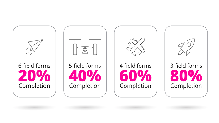
‘Friction’ relates to the resistance that the user feels while going over the form. Asking for less information will lessen the friction as users will have less time to ‘second guess’ themselves and the offer in question, which leads to higher conversion rates overall. Short forms are ideal, where an optimum conversion rate for a three-field form is 25%, but only 15% for like a six-field form.
A Hubspot research on contact forms for over 40,000 of their customers found that conversion rates increased by almost 50% when they reduced the number of form fields from 4 to 3. This sweet spot, again, differs for everyone, but the general idea is to keep it at a low number: from 3 – 5 fields.
Remember that the main goal of any form is to secure a lead, so just focus on that. You can nurture them further down the pipeline, but for now, just get those conversions!
I’m Done with my Lead Form, Now What?
Once you’ve got your lead generation forms optimized and ready for the world doesn’t end there – in fact, it’s only just begun!
Many businesses don’t understand why, despite all their efforts, that their forms aren’t generating enough leads. It’s nearly impossible to pinpoint the exact cause just by looking at stats – we have to monitor carefully to weed out the problem.
Split testing, or A/B testing, is an effective way to determine your form’s performance. Perhaps it could be the placement of your form: maybe it’ll work better if it’s placed below the fold, or perhaps to the top right corner of your website? These questions, or rather, suggestions, are the primary focus of why we do split testing.
In most of the examples that we’ve laid throughout the article, they’ve only ever simply taken away a field from their form, or by changing their CTA. It’s the simplest of tweaks that can make the biggest difference.
It’s a process, not a quick fix.
It will take a while before you’ll find out the cause of your under-performing lead generation forms, but with due diligence, you’ll get there eventually.


