How to Create a Landing Page that Increases Website Conversion
From Open Web to Dream Destination
Online Ads are a fantastic way to generate leads, but it’s only half of the bigger picture. As someone expresses interest in your ad and clicks on it, they’re transported into the most critical component of the entire campaign: the Landing Page.
Make it or break it
Think about a destination where you’ve seen beautiful pictures of, and after strong consideration, you travel to that destination: is it everything you’ve dreamed about?
Landing pages serve as an initial gateway that makes or breaks your campaign with its persuasiveness to convert leads. Having a good first impression counts, and it’s a great way to impress the user again even after they’ve seen your open web ads.
We’ll go through three important tips of building a successful landing page to increase your website’s conversion rate.
In this article:
- Introduction to Open Web Ad Landing Pages
- Step 1: Establishing a clear purpose
- Step 2: Building from the ground up
- Step 3: Optimizing for the best results
Step 1: Establishing a Clear Purpose
Before going knee-deep into optimizing your landing page, establishing a clear purpose is essential to ensure that your campaign is headed in the right direction – what kind of landing page would benefit your sales funnel the most?
There are many types of landing pages that employ different tactics to achieve a common goal: generate leads. Establishing the purpose of your landing page early will help you to optimize it effectively for your target audience.
There are two main types of landing pages for open web ads:
1) Click-through Landing Page
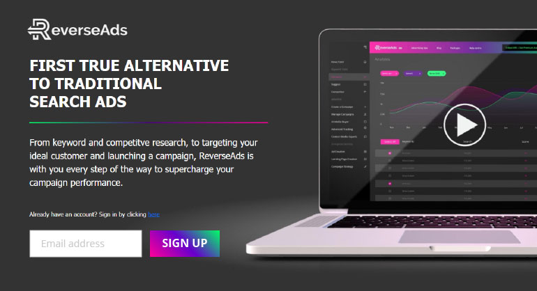
Click-through landing pages are used to pique interest in a user through persuasive and dynamic content (free trials/content, promising to solve their problems, etc.) before directing them to the next page, which will usually be the main purpose of the whole page (e.g., sales page) for a business.
More suited for top of the funnel (TOFU) lead generation, this type of landing page serves as a ‘warm up’ to the end game. It’s great for welcoming new users into the mix, winning their trust, and directing quality traffic down your sales funnel; eventually nurturing and closing a deal with them.
SaaS and e-commerce companies, for example, can make full use of this type of landing page to sell and let users try out the benefits of their products before introducing them to the pricing page after their trial expires.
2) Lead Generation Landing Page
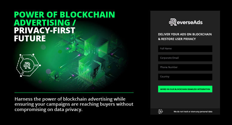
Unlike the simplicity of the click-through landing page, a lead generation landing page helps to collect more in-depth personal information and establishes as many contact points as possible to generate more leads for your business.
This page is more flexible in the sense that you can find a place for it at the top (TOFU), middle (MOFU) or bottom of the funnel (BOFU), depending on how far along you’re targeting users in your sales funnel.
TOFU lead generation pages are associated with valuable content (free stuff, limited-time discounts, etc.) that serve as an incentive to gather the user’s information so that you’re able to nurture the lead over time. BOFU lead generation pages focus on capturing and closing Sales-Qualified Leads (SQL).
Now that we’ve established what type of landing page is most suited for your campaign, we can now start building it up.
Step 2: Building from the Ground Up
Compare these two landing pages – which entices you?

More often than not, users that arrive at your landing page are coming through your open web ads, so they’re already aware of what they’re getting into. The last thing you want to do is to overflow them with information that they already know – focus on the main point!
Having a cluttered landing page confuses the user, especially since 79% of people only scan web pages. With a clear focus, users are more ready to sign up for something on the spot, especially if they’ve already expressed a certain level of interest through your open web ads.
Several elements that make up a great landing page are:
- Website Speed
- It ensures an excellent User Experience – especially since over 40% of people go straight to that red x in the corner if a website doesn’t load in 3 seconds!
- User Interface
- Adopt a minimalistic approach when creating your page. Ensure that
you’re providing your audience with an engaging experience by removing
unnecessary navigational elements, and always remember to optimize it
for mobile users – 51% of internet users shop online via smartphones!
- Checkout Process Optimization
- Create user friendly online since most users won’t have the patience to search for a particular box to fill in their information. Have clear labeling all over your form, or use a drop-down list.
- Branding
- Of course, the aesthetics. Ensure that your brand color scheme, website aesthetics, visuals, and font type are all consistent. Having a defined layout throughout gives your audience confidence that your brand knows what its doing.
- Page Flow / Length
- Limit your landing page to about 2 pages long. Your UI also plays a part here, you’ve got to engage them constantly with your content, design and animation to encourage scrolling.
- Landing Page Content
- Content is arguably the most important part of your page. Having a compelling headline, user reviews and testimonials, a clear offer, and use of language will add to that persuasive tone your landing page is trying to pull off. Keep in mind the 15 second rule – if you don’t capture your audience’s attention in 15 seconds, they’re gone.
That said, your CTA plays a huge role. Personalization also helps CTAs perform 202% better than a generic CTA, so giving it that extra care and attention will dramatically boost your landing page’s impact. Additionally, there are three factors to keep in mind when creating your CTA:
- There is one CTA
- Make it stand out aesthetically
- Have it specific to a purpose
Ensuring that all three points are injected into the creation of your CTA will help the user to instantly grasp the purpose of your landing page, which is key to generating leads.
Furthermore, you could also implement urgency onto your landing page as this motivates people to act. Having visible deadlines or limited-time offers will spur people to strike while the iron is hot.

Once you have the purpose and body of your landing page all fleshed out, it doesn’t end there – you still have to take care of it!
Step 3: Optimizing for Successful Conversion
The road to any successful conversion is uncharted, you’ll have to map it out on your own.
We know that it can be depressing to see a low landing page conversion rate, especially after having invested so much effort into your campaign. But rather than panicking and changing EVERYTHING all at once if numbers are down, A/B test the different components of your landing page first instead.
Start by changing one component at a time to see if numbers pick up, and so on: You’ll be able to accurately pinpoint the problem and save your campaign. A few elements that you could look at would be your default offer: perhaps it isn’t enticing enough for users to want to leave their information behind for a free trial of your product.
It could range from color scheme, typography, image choices to the flow of your page. A good way to pinpoint an issue would be to compare your landing pages to others that are enjoying a high conversion rate.
That said, having a good understanding of your playing field is also important. Compare your ads within the industry you’re in, otherwise, you’ll find yourself comparing apples to oranges; e-commerce to finance – it’s just going to be a mismatch of information and expectations.
Successful businesses, with conversion rates that have improved yearly, reported that they conduct 50% more tests on average – so don’t be afraid to test, test and test!
Additionally, ensure that your conversion data is accurately tracked and saved as it will help to optimize your landing page for the best results moving forward.
Feel free to schedule a FREE consultation with our Open Web Ads campaign team to kick-start your website conversion success!
