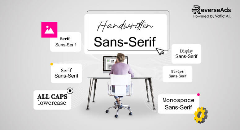
Best Typography Combinations in Banner Ads

Typography is one of the most important aspects of any design, and banner ads are no exception. Good typography can make your message stand out, convey your brand’s personality, and create a memorable experience for your audience. Choosing the right typography combination can be challenging, but with a little guidance, you can create effective banner ads that resonate with your audience.
Please remember that the ideal font combo must suite or combine with your branding!
Here are some of the best typography combinations for banner ads that you can use to improve the effectiveness of your advertising campaigns.

Serif and Sans-Serif
One of the classic typography combinations that works great for banner ads is pairing a serif font with a sans-serif font. This combination creates a sense of balance and contrast that makes your message stand out. Serif fonts are traditional and add a touch of elegance, while sans-serif fonts are modern and clean. You can use a serif font for headlines and a sans-serif font for body copy to create a clear hierarchy of information.

Bold and Regular
Using bold and regular versions of the same font can be a great way to create contrast and add emphasis to specific words or phrases in your banner ad. Bold typography is attention-grabbing and can help to highlight the most important information in your message. Regular typography, on the other hand, is more subdued and can be used for supporting text.

Script and Sans-Serif
If you want to create a sense of elegance and sophistication, pairing a script font with a sans-serif font can be a great choice. Script fonts are typically used for headlines or short phrases, while sans-serif fonts can be used for body copy. This combination can be especially effective for luxury brands or high-end products and services.

All Caps and Lowercase
Using all caps and lowercase typography can create a sense of contrast and help your message stand out. All caps typography is bold and attention-grabbing, while lowercase typography is more subdued and can be used for supporting text. This combination can be especially effective for short, punchy headlines that need to grab the reader’s attention quickly.

Monospace and Sans-Serif
If you want to create a sense of modernity and technology, pairing a monospace font with a sans-serif font can be a great choice. Monospace fonts are typically used in programming and coding, while sans-serif fonts are clean and modern. This combination can be especially effective for tech brands or products that are innovative and cutting-edge.

Display and Serif
If you want to create a sense of elegance and luxury, pairing a display font with a serif font can be a great choice. Display fonts are decorative and can be used for headlines or short phrases, while serif fonts are traditional and add a touch of sophistication. This combination can be especially effective for high-end products or services that need to convey a sense of luxury.

Handwritten and Sans-Serif
If you want to create a sense of authenticity and friendliness, pairing a handwritten font with a sans-serif font can be a great choice. Handwritten fonts are personal and can create a sense of connection with your audience, while sans-serif fonts are modern and clean. This combination can be especially effective for brands that want to create a more approachable and down-to-earth image.
In addition to these typography combinations, there are a few other things to keep in mind when designing banner ads. Here are some best practices for typography in banner ads:
- Choose a font that is easy to read: While it may be tempting to use a fancy or decorative font, it’s important to choose a font that is easy to read, especially when your banner ad is viewed on a small screen or from a distance.
- Assign distinct roles to your fonts: When creating a banner ad, it is important to assign specific roles to different fonts. Ensure that the header, body text, and CTA fonts are carefully selected to play their intended roles effectively. However, avoid using multiple typefaces within the same banner as this can cause confusion for the reader.
- Use a limited color palette: Using too many colors can make your banner ad look cluttered and unprofessional. Stick to a limited color palette that complements your brand colors and helps to create a cohesive design.
- Use hierarchy to guide the reader: Use typography to create a clear hierarchy of information, with the most important information in larger or bolder text. This will help guide the reader’s eye and ensure that they see the most important information first.
- Don’t overdo it with effects: While it can be tempting to use fancy effects like drop shadows or gradients, it’s important to use them sparingly. Overuse of effects can make your banner ad look cluttered and amateurish.
- Consider your audience: When choosing typography for your banner ads, it’s important to consider your audience. For example, if you’re targeting an older demographic, you may want to use larger fonts and more traditional typography. If you’re targeting a younger demographic, you may want to use more modern and playful typography.
- Test different combinations: Finally, it’s important to test different typography combinations to see what works best for your audience and your brand. Try different fonts, sizes, and colors to see what gets the best response from your audience.
In conclusion, choosing the right typography combination is essential for creating effective banner ads that resonate with your audience. By using these typography combinations and best practices, you can create designs that are memorable, attention-grabbing, and effective in delivering your message. Remember to always consider your audience and test different combinations to find what works best for your brand.


