Create to Convert: How Does Design Affect Conversions?

Conversion advertising is an innovative form of digital advertising that focuses on producing customized, highly-converting creatives to increase conversions. Conversion advertising is all about catching viewers’ attention with design features that are proven to generate a positive response.
A larger part of our brain is dedicated to vision than all the other four senses combined. Several studies have associated aesthetics, positive perceptions of order, beauty and creative elements with increased customer confidence and conversion rates. Visual design and user behavior research can be powerfully combined to develop highly converting designs that promote a positive customer experience.
So how do you lead consumers from vision to decision?
Color Advertising
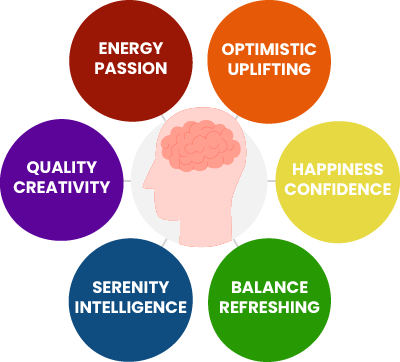
Color plays a key role in conversion advertising, as different colors evoke different emotions.
This means that by strategically using colors in your advertising campaigns and web designs you can trigger emotional engagement and increase conversions.
Studies by CrazyEgg and Digital Synopsis have shown that over 90% of consumers focus on visual appearance when comparing different products, and for 85% of interviewed shoppers, color was the primary reason for buying one of those products.
Moreover, Conversioner has found that color has the ability to attract specific types of consumers and influence their shopping behavior. As an example, impulsive buyers tend to finalize purchases that involve shades of red and orange. Whereas traditional shoppers have expressed a preference towards milder colors such as rose, blue and green.
Depending on the industry you are operating in and on your conversion goal, you might want to consider the following insights to design highly-converting ads and landing pages:

- Blue → commonly used by corporations and businesses to install a sense of trust and professionalism throughout their marketing campaigns. Light blue inspires friendliness and transparency making it easier for customers to engage with your products or services.
- Red → red triggers action and is associated with movement. Red is widely used by fast-food chains to evoke hunger and excitement.
- Orange & Yellow → evoke optimism and promote enthusiasm. They are often used to attract impulsive buyers and window shoppers. Yellow is the most common color choice for CTA buttons, as long as it fits brand image and other marketing collateral.
- Purple → associated with royalty, well-being and luxury. It stimulates creativity and is often used to promote a unique, imaginative solution oriented product or service.
- Green → Green is known as the easiest color our eyes can process and relates to calming and healing emotions. Using a green based background allows you to drive your customers’ attention to other parts of your ad or landing page, such as the CTA.
Catch Them Quick – Visual Hierarchy
Another key design element to positively impact conversion rates is the correct positioning of eye-catching headlines and Call To Actions (CTAs) throughout your ad or landing page to create a clear visual hierarchy. This process is called “attention-driven design”, which basically means optimizing the use of design elements to drive focus to your conversion goal.
Your page attention ratio is the number of actions that can be undertaken versus the number of actions that should be taken, meaning your CTA. The lower your attention ratio, the higher your conversion rate.
Given that the average attention span of a human being is estimated around 8 seconds, you need to make sure your message is clear and that all design elements on your page or ad are leading visitors to your CTA.

For banner ads, whether you are using static or action ads, it is important to follow these steps:
- Give an idea of the product by showing a clear shot
- Insert your brand’s logo and selected CTA in a box
- Create a sense of urgency by giving users only a few seconds to click and presenting the product with bright colors to trigger action.
For landing pages, there are a few fundamental principles of attention-driven design that you might want to consider when designing your page:
- Use direction indicators to drive your visitors towards the CTA → as research shows, elements that are close together are perceived as related to each other.
- Use different shapes to make important elements stand out → anomaly catches attention. You can use anomaly in your favor by presenting your focus element in a different way.
- Focus on continuation by placing elements in a way that encourages viewers to keep reading. Guide your visitors to the final conversion with matching, harmonic visual elements.
Don’t Underestimate The Power of Web Design
Out of all five senses, vision is the most important one, dominating the other four. Given the increase in online competition and the overwhelming amount of ads the average user is served each day, visual elements can make the difference for your advertising campaigns. Design is proven to influence conversions both directly and indirectly: eye-catching headings and CTAs, color advertising practices and a clear visual hierarchy are only some of the elements that can help you boost your conversion rate. Read more about highly converting banner ads and landing pages on our website and learn how to catch your viewers’ attention and convert them into buyers.


